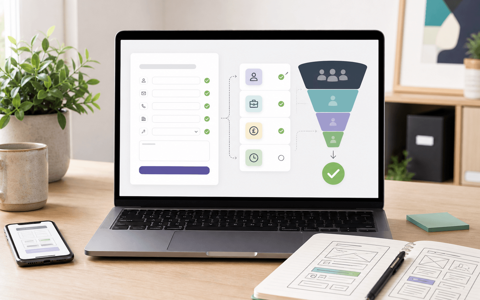
Why your enquiry form affects lead quality
A website enquiry form looks like a small detail, but it often decides what kind of leads a business receives. If the form is vague, the enquiries are usually vague too. If it asks for too much too soon, good prospects may leave before sending anything. The job is to find the middle ground: easy enough to complete, but structured enough to help you understand whether the enquiry is worth your time.
For small businesses, this matters because every enquiry has an operational cost. Someone has to read it, reply, ask follow-up questions, qualify the prospect, and decide what happens next. A better form can reduce that admin before the conversation even starts.
Enquiry form optimisation is not about adding clever fields for the sake of it. It is about shaping the first interaction so a good-fit customer can ask for help clearly, and your team can respond with confidence.
The problem with most contact forms
Most contact forms were added late in the website build. They usually ask for a name, email, phone number, and message. That can work for very simple enquiries, but it does not give much context for service businesses where the right answer depends on timing, budget, location, urgency, or the exact problem.
The result is familiar: messages that say "How much is this?", "Can you help?", or "I need a website" without enough detail to respond properly. The business then has to do the qualification manually. That slows down replies, makes follow-up inconsistent, and can cause serious prospects to cool off.
A weak form also makes measurement harder. If every enquiry arrives as a plain message, it is difficult to see which services are attracting demand, which campaigns are bringing good-fit leads, and which pages need better content.
Ask questions that help the next conversation
A strong enquiry form should collect the few details that make the next step easier. It should not feel like paperwork. It should feel like the natural start of a useful conversation.
For many service businesses, the most useful fields are simple:
- What service are you interested in?
- What problem are you trying to solve?
- When would you like to start?
- What budget range or level of support are you considering?
- How should we contact you?
Not every business needs all of these. A clinic may need appointment preferences. A trades business may need postcode and urgency. A consultancy may need business size and project goals. The point is to ask what changes the quality of the reply, not what satisfies curiosity.
Keep the form short, but not empty
There is a common belief that shorter forms always convert better. Sometimes they do. But more submissions are not always better if they create more low-quality admin. A two-field form can increase volume while lowering lead quality.
The better question is: what is the minimum useful form for this offer? If someone is booking a free download, keep it extremely light. If someone is asking for a quote, consultation, or project recommendation, it is reasonable to ask for a little more context.
Small businesses should be especially careful with forms that look quick but lead to slow follow-up. If the team has to email back three times to understand the request, the form did not really save friction. It moved the friction from the website to the inbox.
Use conditional fields where they reduce clutter
Some enquiry forms become messy because they try to serve every possible customer at once. A beauty salon, accountant, builder, designer, or agency may have several service types with different questions. Showing every field to every visitor can make the form feel heavier than it needs to be.
Conditional fields can help. If a visitor chooses "new website", you can ask about pages, content, and launch timing. If they choose "SEO", you can ask about current traffic and target areas. If they choose "automation", you can ask which process is taking too much time.
This makes the form more relevant without making it longer for everyone. It also gives your team better context from the first message.
Make the CTA specific
The button at the end of a form should confirm the action the visitor is taking. "Submit" is functional, but it does not build much confidence. A more specific CTA can set expectations and reduce hesitation.
Good examples include "Request a recommendation", "Send my enquiry", "Book a strategy call", or "Ask about this service". The right wording depends on what happens next. If someone will receive a reply, say that. If they are booking time directly, say that. If they are asking for a quote, make that clear.
This is a small change, but it helps the page feel more intentional. It turns the form from an administrative endpoint into part of the buying journey.
Connect the form to the page around it
An enquiry form works best when the surrounding page prepares the visitor for it. A form placed under weak copy cannot fix unclear positioning. Before someone reaches the form, the page should explain who the service is for, what problem it solves, what the process looks like, and why the business is credible.
This is why enquiry form optimisation sits alongside service page strategy, copywriting, design, and analytics. The form captures demand, but the page creates the confidence to send it.
For example, a visitor reading a web design page may need to see relevant portfolio work before they enquire. A visitor considering automation may need to understand what can be automated and what remains human. A visitor comparing agencies may want to know who they will speak to and how the project starts.
Measure quality, not just submissions
Many businesses only measure form conversions by counting submissions. That is useful, but incomplete. Ten weak enquiries can be less valuable than three serious ones. If the form is doing its job, you should see better context, faster replies, and more relevant conversations.
Useful signals include how many enquiries become calls, how many calls become proposals, how often people choose the right service, and how much back-and-forth is needed before you understand the request. These are not always visible in standard analytics, but they are visible inside the business.
Over time, you can adjust the form based on real enquiry quality. Remove fields nobody answers well. Add fields that save repeated follow-up questions. Change CTA wording if people misunderstand the next step. The form should improve with experience.
Common mistakes to avoid
The biggest mistake is asking for either too little or too much. Too little creates vague leads. Too much makes the form feel like a job application. The second mistake is using generic field labels that do not match the service. The third is failing to explain what happens after submission.
Visitors are more likely to complete a form when they know what they are getting in return. Tell them whether you will reply, review their request, suggest next steps, or invite them onto a call. That reassurance can matter more than another design tweak.
Accessibility also matters. Labels should be clear, error messages should be useful, and the form should work properly on mobile. A form that is awkward on a phone will lose enquiries from people who are ready to act but short on patience.
Want better enquiries from your website?
If your website brings in messages but too many of them are vague, low-fit, or hard to respond to, EZWebOne can help you improve the journey before the contact form and the form itself. We can review your service pages, enquiry flow, CTA wording, and follow-up process so your website supports better conversations.
Get in touch or book a strategy call to find out where your current enquiry flow is leaking good leads.