Why service pages quietly decide your lead quality
Most small business websites have a homepage, an about page, a contact page, and a few service pages that were written once and left alone. The service pages often look acceptable at a glance, but they do not do enough commercial work. They describe the service, maybe list a few benefits, and then ask the visitor to get in touch.
That is rarely enough now. A good prospect will compare several businesses before they call, book, or send an enquiry. They are looking for signs that you understand their problem, can deliver the outcome they want, and will be straightforward to deal with. If your service page only says what you do, it leaves too much thinking for the visitor.
That is why service page conversion matters. The goal is not to pressure people. It is to make the right people feel confident enough to take the next step, while helping poor-fit enquiries filter themselves out. For a service business, that can mean fewer vague messages, better-prepared calls, and a website that feels like part of the sales process rather than an online brochure.
Start with the buyer's real question
Many service pages open with a company-focused statement: what the business offers, how long it has existed, or why the team is passionate. Those details can matter, but they are usually not the visitor's first concern. The visitor wants to know whether this is the right solution for their situation.
A stronger page starts by naming the problem in the customer's language. A local accountant might talk about business owners who are behind on bookkeeping and unsure what HMRC expects. A clinic might talk about patients who have tried temporary fixes and want a clear plan. A web agency might talk about businesses that are getting traffic but not enough serious enquiries.
This opening does two useful things. It reassures the visitor that they are in the right place, and it gives the page a sharper keyword focus. Instead of targeting a broad service phrase alone, the page begins to capture intent around the problem behind the search.
Make the offer specific enough to judge
A vague service page creates vague enquiries. If the page says you offer marketing, design, consulting, repairs, coaching, or treatments without explaining how the service works, the visitor has to fill in the gaps. That uncertainty often leads to hesitation.
Specificity does not mean overloading the page with every operational detail. It means giving enough shape for a serious buyer to understand what they are enquiring about. Explain who the service is for, what is included, what the process looks like, and what kind of outcome the client can reasonably expect.
- Who is this service best suited to?
- What problem does it solve?
- What happens after someone enquires?
- What does the customer need to provide or decide?
- What makes your approach different from a cheaper or more generic option?
Those answers make the page more useful for humans and clearer for search engines. They also reduce the number of people who contact you with no real understanding of the service.
Put proof near the decision points
Proof works best when it appears close to the moment of doubt. A testimonial hidden at the bottom of the page is helpful, but it may arrive too late. If a visitor is reading about your process, show a short example of that process working. If they are reading about quality, show evidence of quality. If they are wondering whether you understand their sector, link to a relevant project or result.
For EZWebOne, this is why service pages should connect naturally to portfolio examples, specific outcomes, and practical explanations of how the work gets done. A visitor does not need a wall of claims. They need enough evidence to believe the page.
Small businesses often have more proof than they realise: before-and-after screenshots, short client comments, booking improvements, clearer enquiry flows, reduced admin, or a stronger local presence. The important part is to place that proof where it supports the next decision.
Use CTAs that match the buying stage
Not every visitor is ready to book a call immediately. Some are comparing options. Some are checking whether your service is within the right ballpark. Some want reassurance that you understand their business before they spend time speaking to you.
A high-converting service page usually needs more than one call to action. The main CTA can still be direct, such as booking a strategy call or sending an enquiry. But the page can also offer softer next steps, like viewing relevant work, reading a guide, or learning about the process.
The mistake is making every CTA feel the same. A button that says "Learn More" tells the visitor almost nothing. A better CTA makes the outcome clear: book a strategy call, view similar projects, check the service process, or request a practical recommendation.
If your page is already attracting visitors but enquiries are weak, this is one of the first places to look. The CTA may not be wrong because of its colour or position. It may be wrong because it does not match what the visitor is ready to do.
Answer objections before the contact page
Most buyers have quiet objections before they enquire. They may wonder about price, timing, trust, disruption, support, or whether the service is too much or too little for what they need. If your service page ignores those doubts, the contact page has to do all the work.
You do not need to publish every price if your work is custom, but you can explain what affects cost. You do not need to guarantee exact results, but you can explain the factors that shape outcomes. You do not need to list every possible scenario, but you can answer the doubts that come up repeatedly on calls.
This is where a short FAQ section can earn its place. It should not be filler. It should deal with genuine buyer friction. Good questions might include how long the work takes, what happens before the project starts, whether existing content can be reused, or what support is available after launch.
Connect conversion and SEO instead of treating them separately
SEO can bring the right people to a service page, but conversion decides whether that visibility becomes business. The two should not be separated. A page written only for rankings can sound stiff and unconvincing. A page written only for persuasion can miss the search intent that brings buyers in.
The strongest service pages do both. They use natural headings that match what people search for, but each section exists because it helps the visitor make progress. A page about website design, SEO, automation, or AI agents should answer practical buying questions as well as include relevant search language.
That balance is especially important for UK small businesses, where trust and clarity often matter more than big-brand polish. Visitors want to know that the business is credible, local or accessible, organised, and able to help without making the process unnecessarily complicated.
A simple service-page structure that works
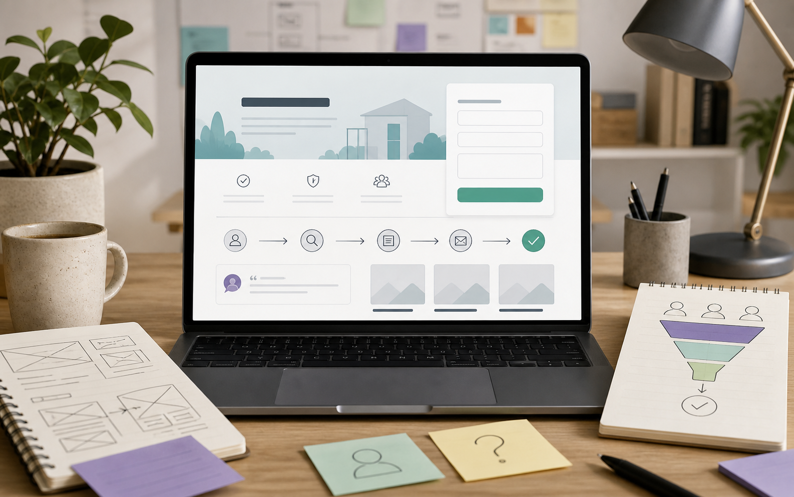
There is no single perfect layout, but most effective service pages include the same core ingredients. The order can change depending on the offer, but the page should not leave any major decision gaps.
- A clear opening that names the service and the buyer's problem.
- A concise explanation of who the service is for.
- Specific outcomes or improvements the service is designed to create.
- A simple process section that shows what happens next.
- Proof through testimonials, examples, results, or relevant project links.
- Answers to common objections and practical questions.
- A direct CTA that makes the next step obvious.
For many businesses, improving this structure is more valuable than redesigning the whole website. The page may already have enough traffic. It may simply need to do a better job of turning attention into trust.
When to review your service pages
A service page should be reviewed whenever your offer changes, your enquiries become less relevant, or your traffic grows without a matching lift in leads. It is also worth reviewing after speaking to customers, because sales calls often reveal the exact doubts your website should be answering earlier.
Look at the page with one practical question in mind: would a good-fit buyer know enough to take the next step? If the answer is no, the page needs more than nicer wording. It needs clearer positioning, stronger proof, better structure, and a CTA that respects where the buyer is in their decision.
Want your service pages to bring better enquiries?
If your website looks decent but still does not bring the right conversations, EZWebOne can help you review the pages that matter most and turn them into clearer lead-generation assets. We can look at your current structure, search intent, proof, and enquiry journey, then show you what to improve first.
Get in touch or book a strategy call to map out which service pages are costing you enquiries and what to fix next.